
First of all, I’m not a UX or UI expert, but I was once told to speak my mind if I see someone doing something wrong or illogical. So here it goes.
Tinder. Everyone knows about it and even those in relationships have checked it out to see what all the fuss is about. I was a heavy user myself, and had my share of Tinder anecdotes, but I’ll save these for another occasion.
I’ll try to describe why I think Tinder needs a redesign although it’s already successful and famous for their use of swipe gestures. Not only that, they are often considered as a model of good app design. What if I told you they did it wrong and no one even noticed? Even worse, people actually copied their mistakes. Call me crazy, but I think there is a swipe conspiracy going on.
What is Tinder?
I’ll give you a short intro to Tinder, just in case you’ve been living under a rock or you’re not so familiar with how it works. Tinder is a mobile dating app that helps you find other lonely and (mostly) single people nearby.
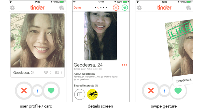
After launching Tinder and connecting with your Facebook account, Tinder shows you a card of a woman/man in your proximity while also displaying some basic info (name, age, mutual friend count and mutual interests count) which helps if you are looking for something more than just… playing Jenga! ;)
- To see more pictures or more info about that person, tap the small “i” button or tap anywhere on the card. After that, the app switches to the details screen seen in the image above.
- If you are not interested, either tap the (x) button or swipe the card left.
- If you like the person you are viewing, either tap the (heart) button or swipe the card right. (third image)
- If that person likes you back, you get a notification and you can start chatting.
Swipe logic… or lack of it
I think the general idea is great and simple but I believe it can be done even better. So let’s get down and dirty.
First, I would change the swipe directions. So many times have I swiped left wanting to jump to the next profile picture while foolishly thinking I was looking at the details screen. And just like that, forever changing the course of my life and the universe as we know it. Although they recently implemented “undo” feature for paid users, I still think it is a problem of bad design and now you have to pay to overcome it… brilliant! :)
I look at the digital world as an extension to the physically world we live in, and I believe pulling the profile card towards me is the natural gesture I want to make when I see someone I like, since I want to pull them closer. Therefore it is only logical that if you don’t like someone, you should push their card away from you or in other words, up.
I encountered the same issue while doing some client work building a more advanced Contacts Book app. One of the screens within the app displays cards from your contacts in a similar way Tinder does but utilizing all four directions as separate actions. Although I believe anyone repeatedly using an app will eventually learn which gesture is linked to which action, it is better to try and build these actions so they feel intuitive. Therefore I suggested the gesture of swiping up for discarding a contact’s card since it feels like you are throwing it away, while pulling it down would feel like you are taking the card and storing it.
Anyway, let’s get back to Tinder. Now that we’ve removed left and right gestures, we can finally use them for something that feels natural on mobile devices, and that is swiping through pictures of our future date. Get your creepy face on and do it like a real stalker.
Drop that screen. Less is more
Tinder doesn’t need the details screen that puts the app in a different mode making their reputable (but wrong) gestures not usable. Not only that, the UI elements that were on the bottom of the main screen move to the top right corner of the details screen. That transition right there is a UX nightmare. It only works because we got used to it. I would utilize the same gesture (tapping the card itself) to flip the card and extend it’s height to fit in the description and a full list of mutual friends and interests. That way we can still swipe the card up or down if we like them or not. Swiping left or right while the card is flipped would flip it back and start displaying pictures from start or end depending on the direction. Also, after we see all the images in normal mode, swiping further right could flip the card to display the details.
Just because things work well and meet their purpose, doesn’t mean that they can’t work better while still doing the things they should. Don’t touch it! It works! Those are the famous last words of all big companies that were run over by their competitors.
If you don’t agree with me that the UX is at least a bit weird, you’ve probably used the app too much and got indoctrinated in the process. There is no help for you and you should stick to using apps and not building them :P
That’s it. I don’t think these ideas are revolutionary and I’m sure others have had similar observations… and it makes sense, because they are logical. And logic is how I roll :)
Stay tuned by following us on twitter or say hi.